


Animated monograms for a ramen restaurant.
Drag or click anywhere to reveal each style.
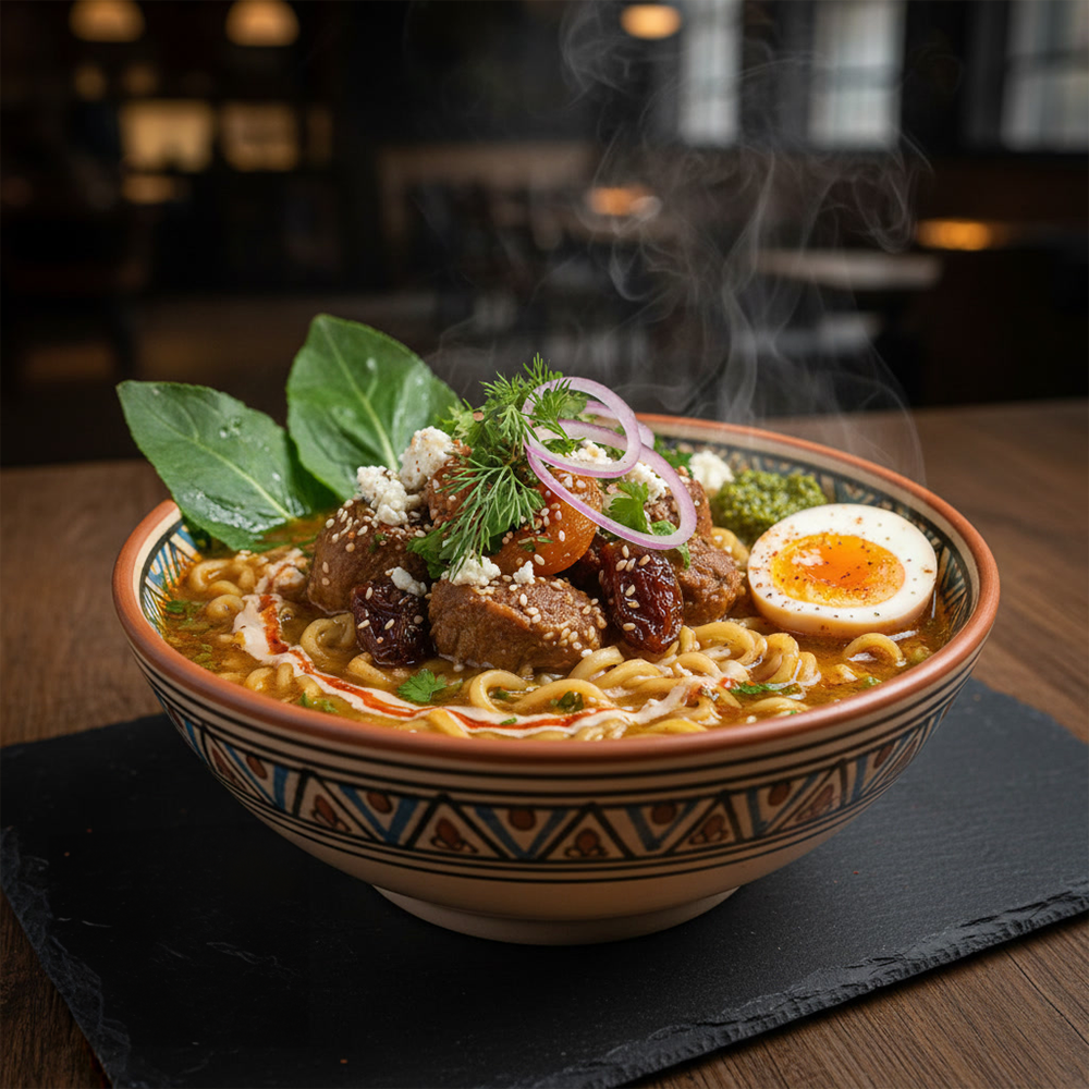
Noodles for date night.
Drag or click anywhere to reveal each style.
Express chariot noodle delivery.
Drag or click anywhere to reveal each style.
One brand. Two flavors.
By presenting these two art styles side by side, the project explores how visual language can dramatically shift brand perception while maintaining the same core narrative. The study highlights how illustration style, character design, and graphic treatment can guide audience interpretation.
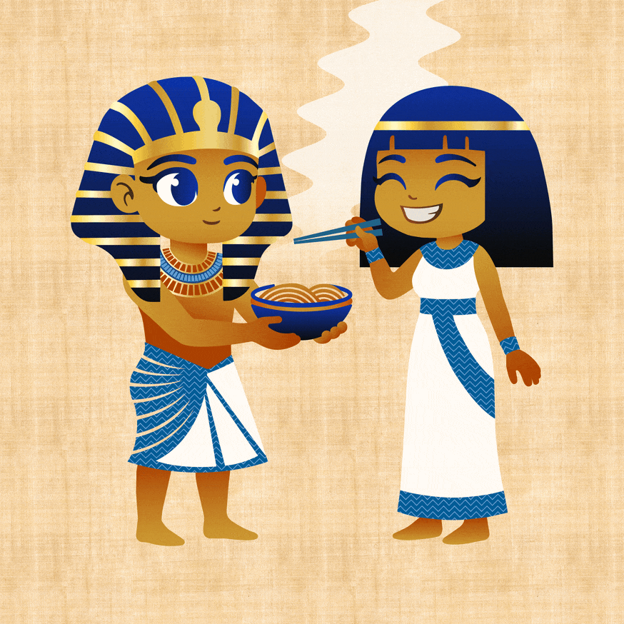

Tutenramen
This exploration developed two distinct visual directions for the same brand concept. The first drew from modern Egyptian graphic influences, emphasizing geometric composition, symbolic iconography, and a sense of prestige. The second reimagined the concept through a stylized anime aesthetic, introducing a playful tone that reflected the ramen brand’s Japanese influence.
While the client ultimately selected the modern Egyptian direction, pop-up survey feedback showed stronger engagement with the anime variant. The response illustrated how illustration style can shape brand perception: the Egyptian approach conveyed heritage and authority, while the anime direction communicated humor, personality, and character-driven storytelling.
Because the brand draws on pseudo-historical references, the more cartoony style allowed the humor to land more naturally. Although the Egyptian treatment carried greater prestige, the anime interpretation proved more flexible, shareable, and memorable.


_2.jpg)


.png)


