Ρhishy Design TheorΨ
October 4, 2017
CARP stands for Contrast, Alignment, Repetition, and Proximity — four visual design principles doing the heavy lifting behind every layout that just feels right. They’re the difference between a bunch of elements sitting on a page and a composition that actually communicates: contrast builds hierarchy and focus, alignment creates order and relationships, repetition ties everything into a system, and proximity tells the viewer what belongs with what. They aren’t rigid rules so much as instincts you can train. Here’s how each one works, and how to start spotting them everywhere.
φ

Contrast
Make important elements stand out through differences in size, color, weight, or type. Clear contrast creates hierarchy and guides the viewer’s attention.

Alignment
Line up text, images, and other elements along shared edges or axes. Consistent alignment gives a layout structure and makes it easier to follow.

Repetition
Repeat colors, typefaces, shapes, and styles to create a consistent visual rhythm. These familiar patterns connect the parts of a design and make it feel unified.
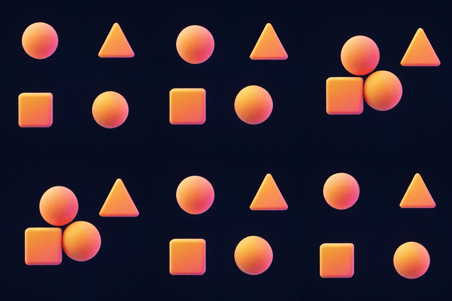
Proximity
Place related elements close together and give unrelated groups more space. Thoughtful spacing makes relationships clear before the viewer reads a word.

Animator, designer, and illustrator
Sharing is caring
If you found value in this blog post, please take a moment to share it.