

tutenramen: one brand, two flavors
October 16, 2026
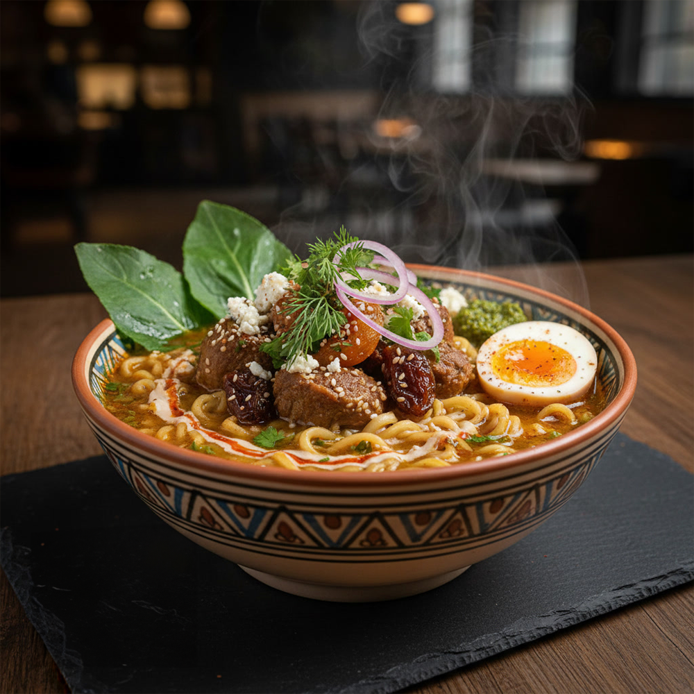
Tutenramen is a ramen concept I designed twice: once as a refined Modern Egyptian brand, and once as a Chibi Anime variant, both wrapped around a recipe with warm spices drawn from North African tradition. Here’s how each direction played out.
Two bets, one brand
Every brand identity makes a bet on how people will respond to it. The Modern Egyptian direction bet on culinary tradition, character, and prestige. The Chibi Anime direction bet on charm, humor, and expression.

Modern Egyptian
Geometric composition, symbolic iconography, and gold detailing give this direction a ceremonial feel. It conveys heritage and authority, and it made the ramen feel like a royal ritual.
Chibi Anime
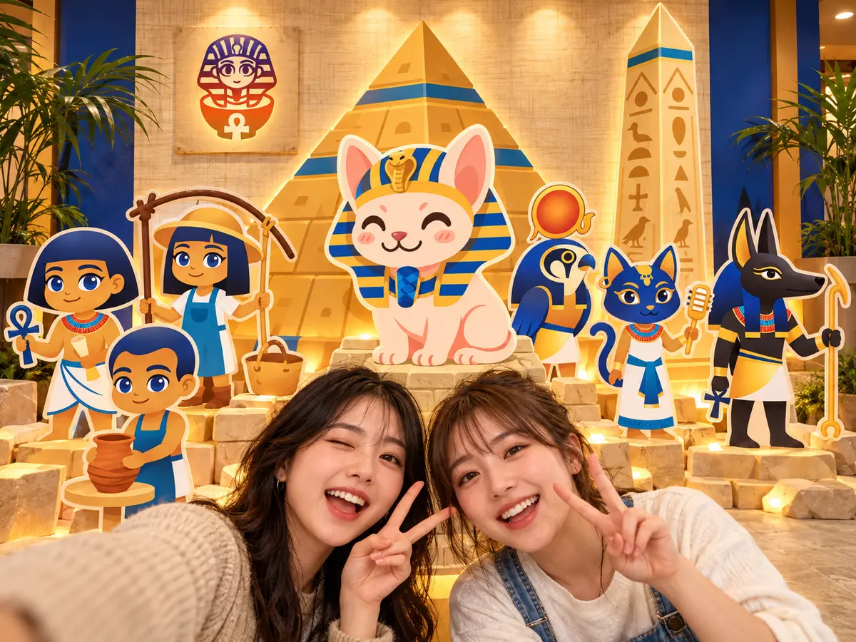
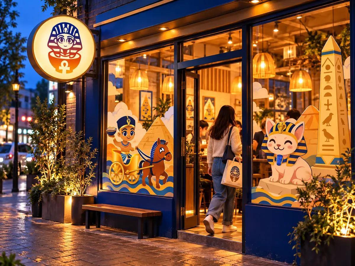
The same concept, reimagined with a stylized anime look that nods to ramen’s Japanese roots. Because the brand leans on pseudo-historical references, the cartoony style let the humor land more naturally.
Bringing the brand to life
Motion gave each direction a distinct personality. Modern Egyptian felt ceremonial and prestigious, while Chibi Anime felt playful, expressive, and full of energy.
What the audience revealed
An illustrative four-week study combined guest activity with QR-code exit surveys. Chibi Anime led on sharing (68% vs 34%), unaided recall (82% vs 58%), guest-created posts (2.3× as many), and menu trial intent (76% vs 53%). Modern Egyptian still led on premium perception, scoring 86 against 57.
Designed for the feed
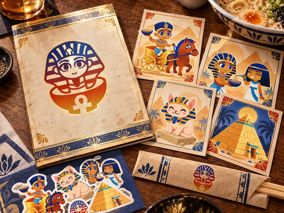
Each direction extended into its own social identity. Guests photographed the Modern Egyptian bowls for their polish, while the Chibi Anime characters, packaging, and printed menus turned dinner into something people wanted to share.
Which one wins?
The Egyptian approach carried greater prestige, but the anime interpretation proved more flexible, shareable, and memorable. Style shapes perception: the same brand story reads very differently depending on how it is drawn.
See the full case study with the interactive style comparisons: One brand. Two flavors.

Animator, designer, and illustrator
Sharing is caring
If you found value in this blog post, please take a moment to share it.